First a disclaimer: this is my personal viewpoint and opinion, so take it with a grain of salt. As a somewhat advanced computer user since the pre-Windows days, I’ve had a chance to see the coming and going of a number of Microsoft operating system versions. Recently, after being asked once again my opinion about the latest one, Windows 10, I thought it might be useful to show it in a graph, compared to a number of earlier operating systems.
This graph shows, from my point of view, the value of the last few Windows Operating Systems, on a scale of 1 to 10:
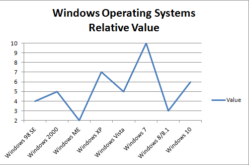
As you can see I consider Windows 7 the unsurpassed pinnacle of Windows Operating Systems. Some may wonder, what was the criteria for the above graph? Is it based on reliability, performance, security, privacy, user friendliness, stability, overall popularity? I’d say all of the above. But again it’s just my viewpoint.
I hope this better answers the question about what do I think about Windows.